Sometimes you end up being the designer.
Developers often find themselves sitting in design roles, despite design not being their job description. While this is not an ideal situation, it is often the reality we find ourselves in. While funny, the term "designed by a programmer" is often accurate. It is very easy to spot designs created by programmers or developers who don't understand design fundamentals well. Let's get rid of that term and take a quick crash course into design fundamentals. In this post, I will share eight design fundamentals and a few best practices to help you design better-looking interfaces. One important thing to remember is that: Design is subjective, and ultimately use your best judgment when creating your designs.
The Eight Fundamentals
1.) Lines
Lines are the building blocks of design. They create shapes and give form to different components. Lines can come in varying lengths and thicknesses, and your use of lines can convey different messages. Most lines will fall into two types: an implied line (elements or rectangles next to each other) or a literal line. Lines are great for separating information and creating emphasis on specific areas.
Here is an example of a literal line creating emphasis:

Here is the same design with an extra line added and line thickness changed:

Notice that the design seems off now because the line no longer creates emphasis but instead groups information.
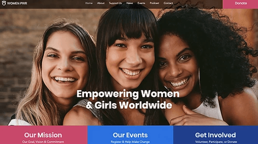
Here is an example of an implied line separating information. The different colors create a color-blocking effect separating the information.
2.) Shapes
A logical step up from the simple line would be a shape. Shapes can convey emotions and create different feelings depending on their alignment and size. They tend to fall into two categories: geometric or fluid. Geometric shapes are uniform and mathematically perfect. These shapes tend to convey strength and organization. Fluid shapes are natural shapes that tend to have many curves and are irregular mathematically speaking. Fluid shapes feel more relaxed and calming. Fun fact: The most common shapes in web design are the square and rectangle.
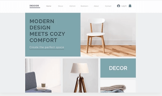
Here is an example of how geometric shapes convey a sense of organization and structure:
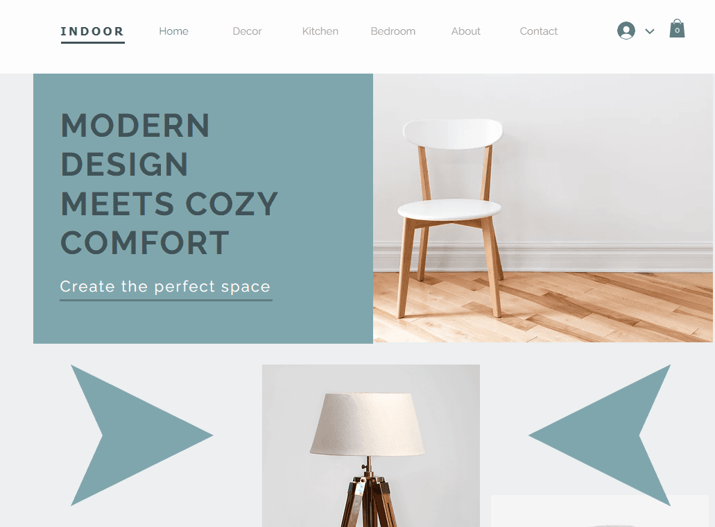
Here is the same design, but I removed some of the rectangles that contained products. This has broken the organization of the grid and made the design look confusing, despite it not breaking any other design fundamentals.
Here is an example of mixing fluid and geometric shapes in the same design. There is no hard-fast rule stating that you cannot combine both but be careful of creating a visually cluttered layout.
3.) Color
Now that we have lines and shapes let's talk about color. Colors convey different messages and meanings. Color theory is an entire school of thought and can get complex once we start talking about complementary colors, tertiary colors, hue, saturation, lightness, etc. My advice for this section is to use a premade color palette and understand the emotion you want to evoke from your users. You can use online generators for free or look at the color palettes from other websites you like. Color is one of the easiest design fundamentals to get wrong; however, it makes a huge difference when done correctly.
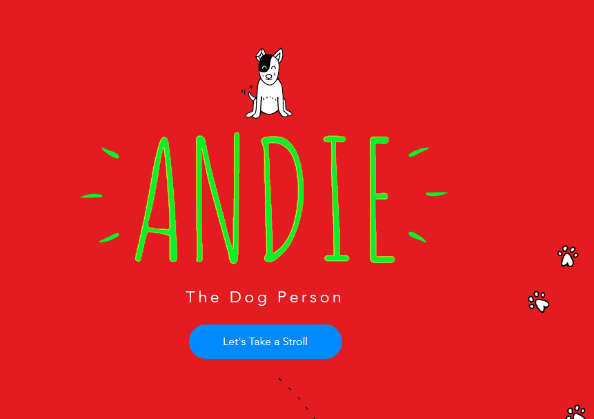
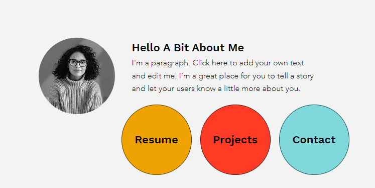
Here is an example of terrible color choices:
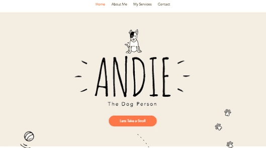
Here is the same design with colors that work well together:
4.) Contrast
Contrast is heavily related to color, so talking about this one next makes sense. Contrast is a very simple fundamental to understand; unless you are making a deliberate design choice, you want to ensure enough visual difference between elements to let users know where you want them to look. Contrast is best explained with pictures.
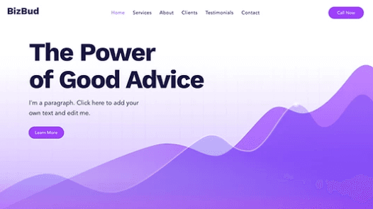
Here is an example of a landing page with good contrast. It is apparent to the user where the CTA is and what you want the user to do.
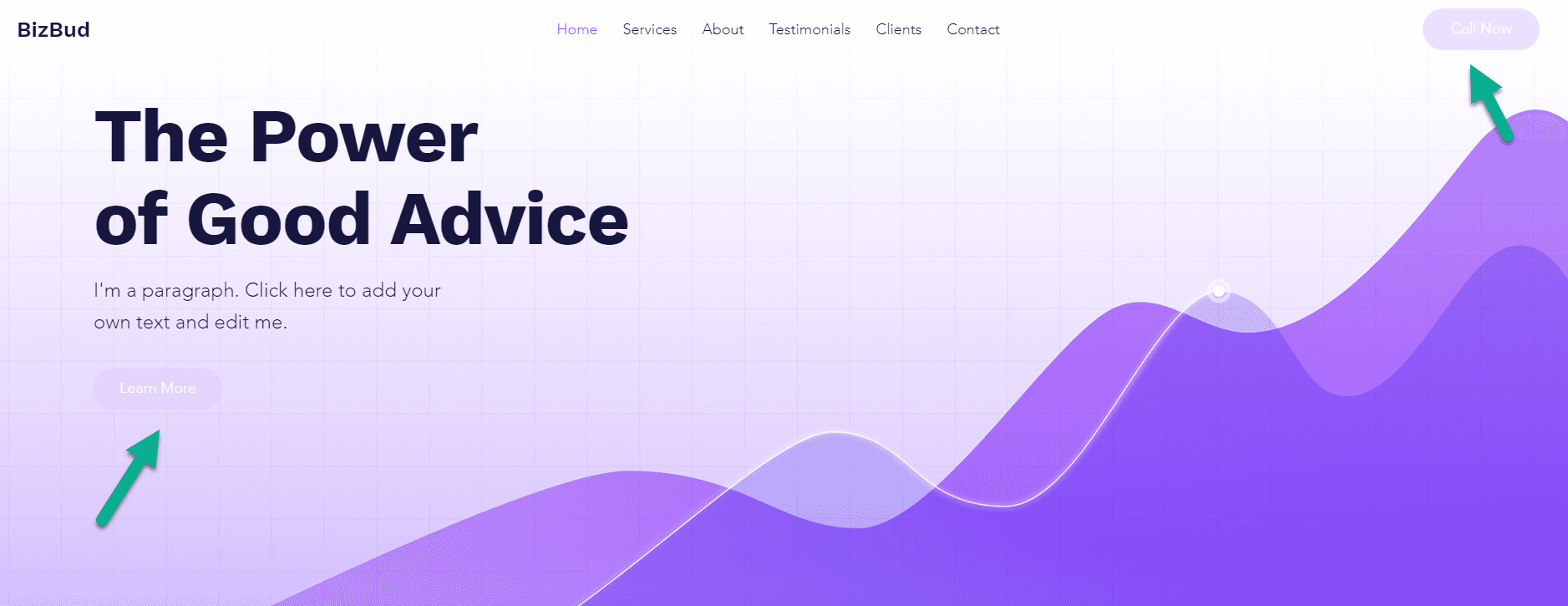
Here is an example of bad contrast. Everything has a similar color; it is hard for users to know what they are supposed to do.
5.) White Space
White space is the empty or negative space around different elements on your page. White space can serve a few goals. It can focus user attention, separate elements, or convey feelings. A quick note here, white space doesn't always have to be white. It is just space free of elements. Let's see a few examples.
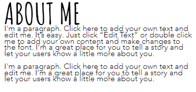
Here white space is being used to separate elements. White space separates the heading from the paragraph text and the background.
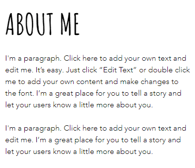
Here is the same text but with white space removed. White space is vital to how information is formatted.
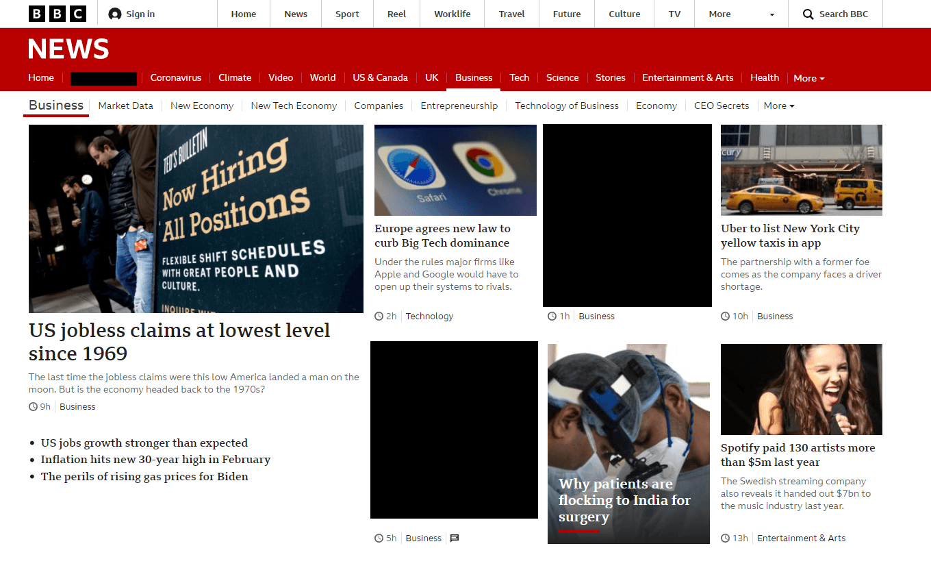
Now let's look at how white space can convey feelings. In this example, the BBC website has a much more compact design emphasizing getting more information on the screen. This creates a rushed and crowded feeling.
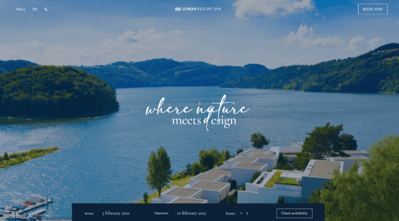
In this example, the resort page uses white space to convey ease and a serene feeling.
6.) Typography
Similar to color, typography is its own school of thought. When selecting the font types for your design, it is important to consider the other UI design principles such as white space, color, contrast, hierarchy, and alignment. We will speak about hierarchy and alignment later in this post. You want your fonts to work well together. Fonts that are too large or too similar can look bad when paired together. When choosing a typeface pair, it is vital to consider the feeling you are trying to convey; certain fonts evoke feelings of nostalgia, and others can evoke elegance. Regardless of the fonts you choose, remember to pick legible fonts and view the font pairs on different screen sizes. Not all fonts look good when scaled up.
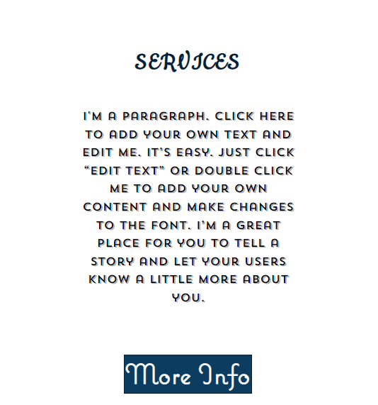
Here is an example of bad typography. Three different typefaces appear in a small space, creating no consistency. The heading typeface is hard to read. The paragraph typeface is in all caps and could be considered a display font or heading typeface. None of these typefaces work well together, and they all invoke different emotions.
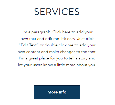
Here is the same paragraph with easier to read and more cohesive typefaces:
7.) Scale & Visual Hierarchy
While these can be considered separate design principles, scale and visual hierarchy work well together. Scale is a straightforward design principle. Elements of a similar type should be of a similar size. For example, if you are creating a grid, most of the items in the grid should be of similar size and take up the same amount of space. It's fine to have elements that don't conform to this rule, but too many incorrectly sized elements look weird. Let's take a look at an example.
Here is a design in which we kept the "grid" but changed the size of the elements. This is visually confusing and makes for an unpleasant design.
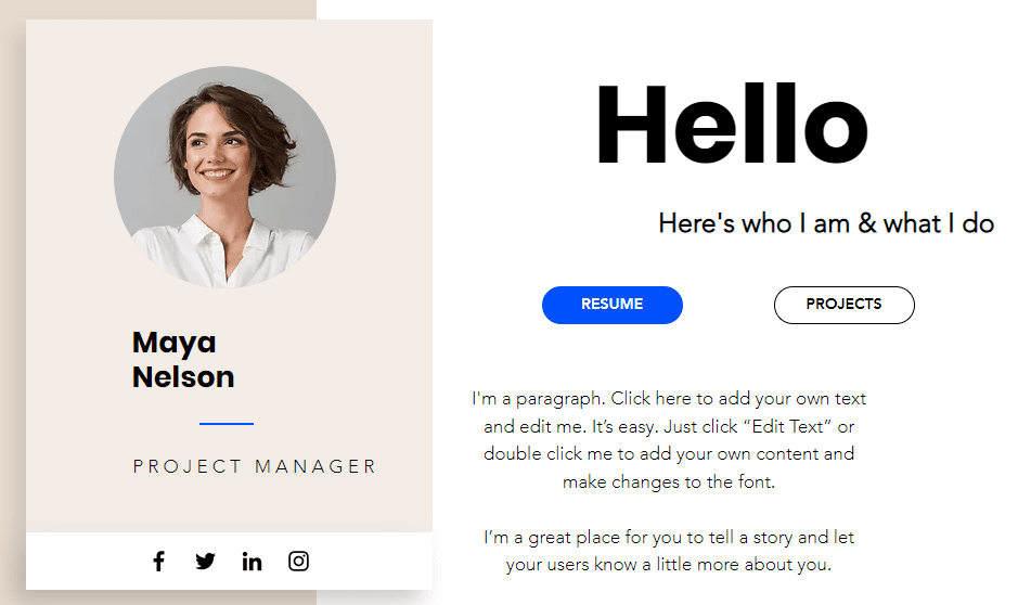
Visual hierarchy is related to scale. It is through the use of scale that visual hierarchy is created. You can direct a user's attention by having important elements be different sizes or colors. If there is no hierarchy present in your designs, they can often look flat or lack contrast. Hierarchy is best explained through visuals.
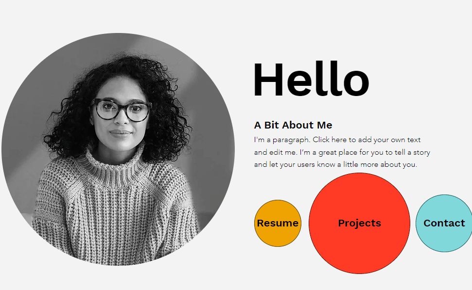
Here is an example of visual hierarchy done right. The larger photo and typeface make it easier for the eye to understand where to look first. The differences in shape help separate information.
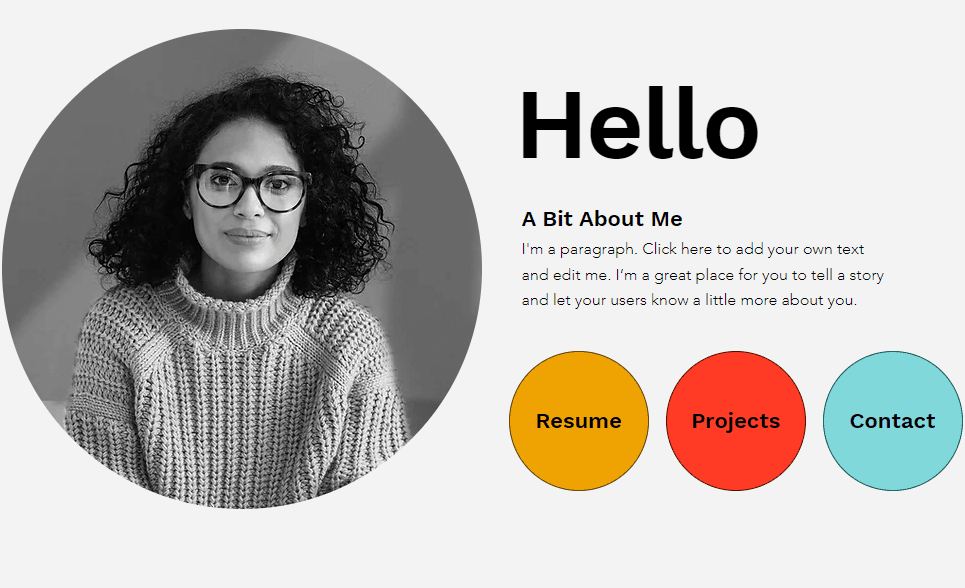
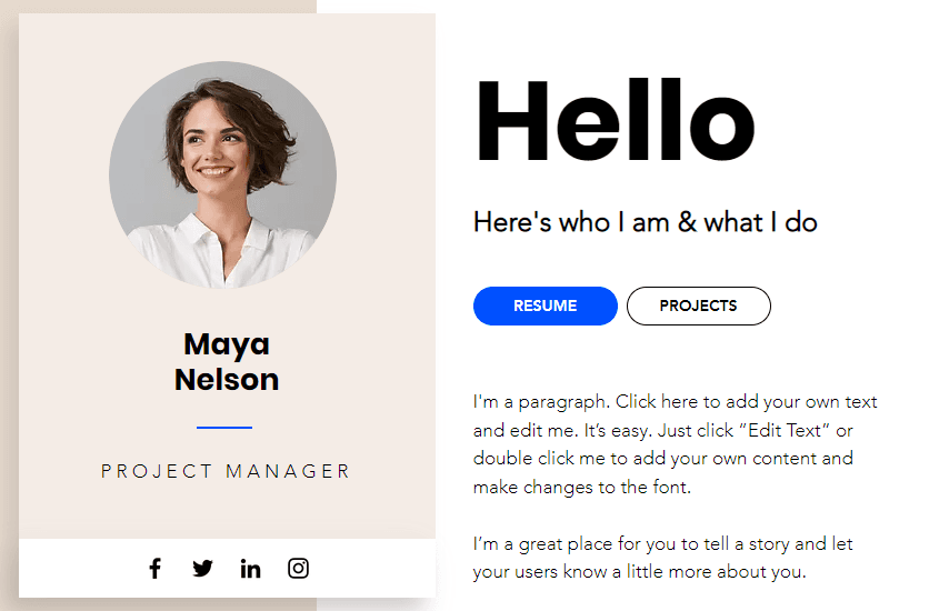
Here is the same picture, but the visual hierarchy has been removed. This design makes it harder for the eye to pick a spot to land on. It is not a terrible design, just harder to understand.
8.) Alignment
The last design principle is alignment. There is not much to say here, honestly. Alignment is a very visual principle, and it's the idea that the position of all your elements should make sense in relation to each other. That's it. Example time!
Here is an example of bad alignment. Elements are hanging around with no connection to one another.
Here is an example of good alignment. Everything just makes sense in relation to one another.
Now that you understand the eight basic UI design fundamentals let's talk about a few best practices and how everything fits together.
Best Practices
1.) Know your user. This is self-explanatory, but you should have a good idea of the primary demographic for your product or service. Creating user stories or mapping customer journeys can help understand what users may need and who they might be. Knowing your user enables you to choose the correct emotions for your design. Design fundamentals that tie back to this area are color, typography, and shape.
2.) Actionable steps. Ideally, we want users to interact with the design in a particular way or sequence. If we want this to happen, we must make it easy for users to understand what we want them to do. This can include "call to actions" in a different color, buttons for scheduling calls that are bigger than other buttons, etc. Design fundamentals that tie back to this area are color, contrast, and visual hierarchy.
3.) Use references. Overall this will make your life easier. If you are a developer that is not a designer, coming up with new and fresh ideas can be complicated. Using references or examples can help immensely in creating new designs. Websites like behance or dribbble are great places to find inspiration for your designs.
4.) Keep it simple. Often less is more. Your design should tell a story. What is the product? How does the product work? How can your design help the user solve their problem? That's it, nothing else. A simple design is easy to maintain and update.
5.) Test & Validate. A very boring best practice but a useful one. After staring at a design for a while, we are often blind to its faults or shortcomings. Spend some time watching other people interact with your design to locate bugs and observe if people are reaching the desired outcome.
Fin
That was a lot of information to absorb, but hopefully, you can now create better-looking designs. No design fundamental is more important than the other and they all work together to create seamless designs. If you follow the fundamentals and best practices, you will have great-looking designs in no time. You can stay looped into all things Render, and learn more about UI/UX on our Discord, Twitter, and TikTok. You can find me on Twitter @thatDevTaylor.